Summary I identified the issues blocking our SaaS product’s adoption and free-trial conversion. I refactored the design, broke it down into incremental deliverables, and worked closely with the development teams to release the changes. The updates increased trial conversion rates by 3 times.
Background
From 2018 to 2021 I was the lead UX designer at mabl, a SaaS startup. mabl, the product, was a software test automation tool and had been on the market for about a year when the company hit a rough patch in its growth. Two metrics stood out:
- 5% free-trial conversion rate. The 14-day free trial was a key go-to-market strategy but was not pulling its weight.
- 75% of lost sales opportunities cited ease of use as a factor.
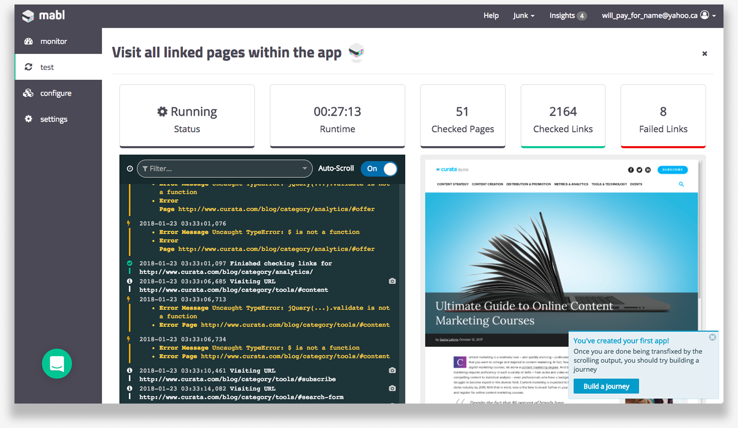
Immediately after joining the company, I usability tested the pre-beta product and found significant issues:
- Confusing and unfamiliar terminology
- IA and navigation issues
- New users were first introduced to secondary functionality that they misinterpreted to be mabl’s main value proposition
The overarching problem was users were hit with too many concepts all at once. There was no clear path forward, so they abandoned the trial.
At that time all of us were too busy readying the new product for release to address these problems.
Project Goals
However, slowing sales forced us to prioritize fixing these fundamental product issues. The goals were simple:
- Improve the trial conversion rate to the industry benchmark of around 15%
- Improving the new user experience and ease of use cited by the sales team
- Keep our existing customers happy and productive (no drastic changes)
Thankfully, I had been researching and thinking about these issues for a while.
Research
After the chaos of the product launch, most of the team worked on new functionality to hone in on product-market fit. In addition to working on new features, I worked with small scrum teams on low-effort enhancements to improve the trial experience. We treated each of these updates as experiments and learned from each through usability testing and trial data analysis using FullStory and our own internal analytics.
Experiment 1
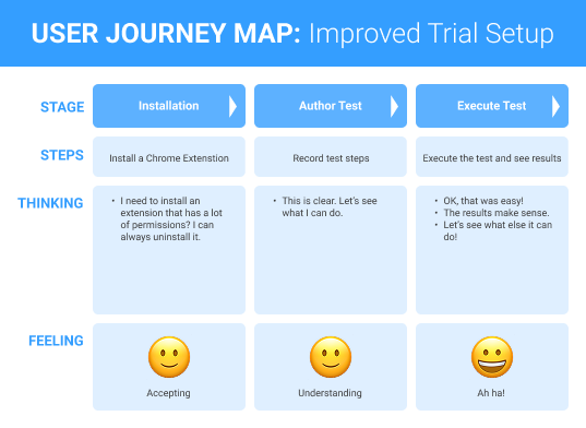
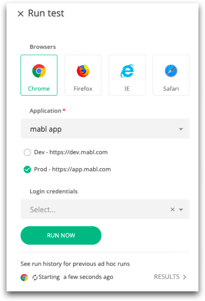
First was an onboarding wizard designed to get new users to install a requisite Chrome extension and introduce concepts and terminology.
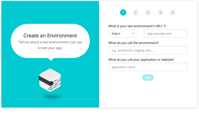


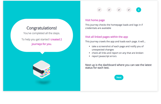
The wizard had a modest positive impact but did not move the needle significantly. It forced users to install the required extension, which they needed to fully evaluate the product, but the brief explanations were ineffective.
Experiment 2
With the help of G-W Studios, we did a visual redesign and also addressed some of the navigation issues. While the sales team appreciated the changes and the app looked much better, this change also had no measurable impact on trial metrics.
Experiment 3
Finally, we tried incorporating AppCues in-application guidance to move help and suggestions closer to when the user needed them. This also had no measurable improvement (I write more about such tools in my blog).
Redesign
This continuous learning paved the way for the redesign. mabl’s fundamental problem was that new users hit a wall of new concepts that needed to be learned all at once to do even the most basic task. I needed to redesign the product’s conceptual model in conjunction with smoothing out the new user journey.
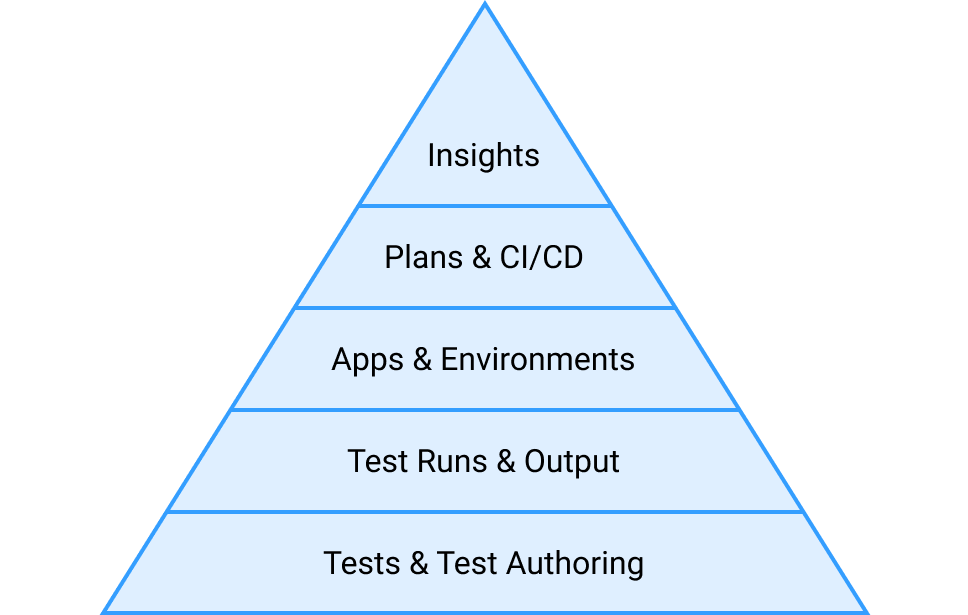
To aid in explaining the plan to the team, I illustrated the new conceptual model as a pyramid to show a logical order concepts should be introduced. Each layer of the pyramid was a clearly defined concept that, once learned, enabled users to accomplish something tangible and set them up for the next layer.
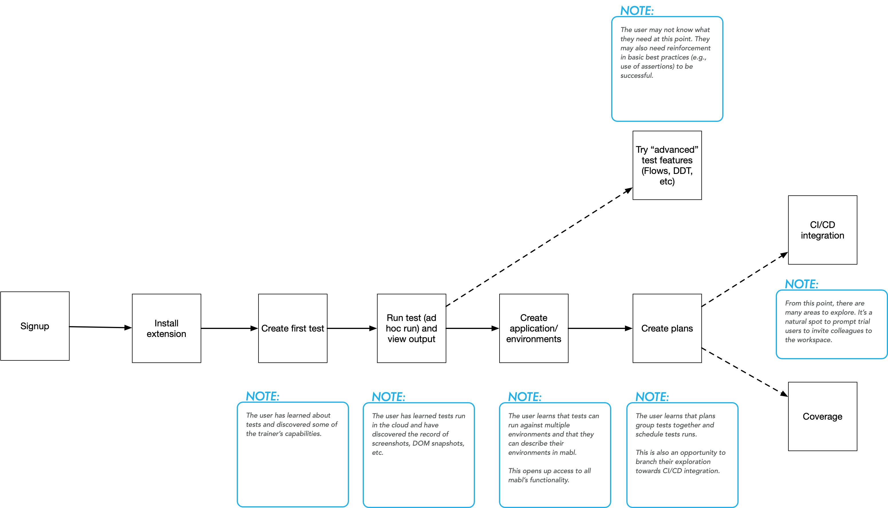
The new user’s journey looked something like this:
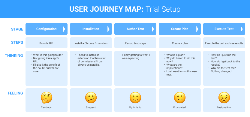
My goal was to simplify it to this:
Eliminating just two steps would make it quicker and easier to try out mabl’s core value (creating and executing robust tests) and discover what else mabl offered. However, that was not a simple proposition due to some early design assumptions and dependencies. In collaboration with the product and engineering teams, we worked out the least disruptive ways to make two significant product changes explained below.
1. Independent Tests
To execute a test mabl required users to create a “plan”. A plan contained one or more tests, scheduling information, test environment info, and more. By themselves, plans had usability issues and further dependencies which needlessly complicated the usage for both new users and existing customers. For example, customers were forced to create additional, temporary plans when attempting to diagnose a failing test.
I designed a simple UX enhancement enabling independent test runs and, more importantly, worked with engineering to break the underlying dependency on plans. This product update benefited existing customers immediately and set us up for the next stage.
2. Empty Beginnings
With plans out of the way, I redesigned the new user journey to introduce mabl’s concepts as shown in the pyramid. I incorporated learnings from our earlier experiments and set these design goals:
- Enable Exploration – New users needed to orient themselves and learn their way around the app without being forced through a particular flow.
- Provide Guidance – AppCues showed there was promise with in-app guidance but we needed to use the application’s state to provide meaningful and timely help. We moved away from AppCues because this was something more easily done ourselves.
This design work included:
- Workflow and system state transition design
- Wireframes
- Interactive prototypes
- Detailed design specs
Workflow
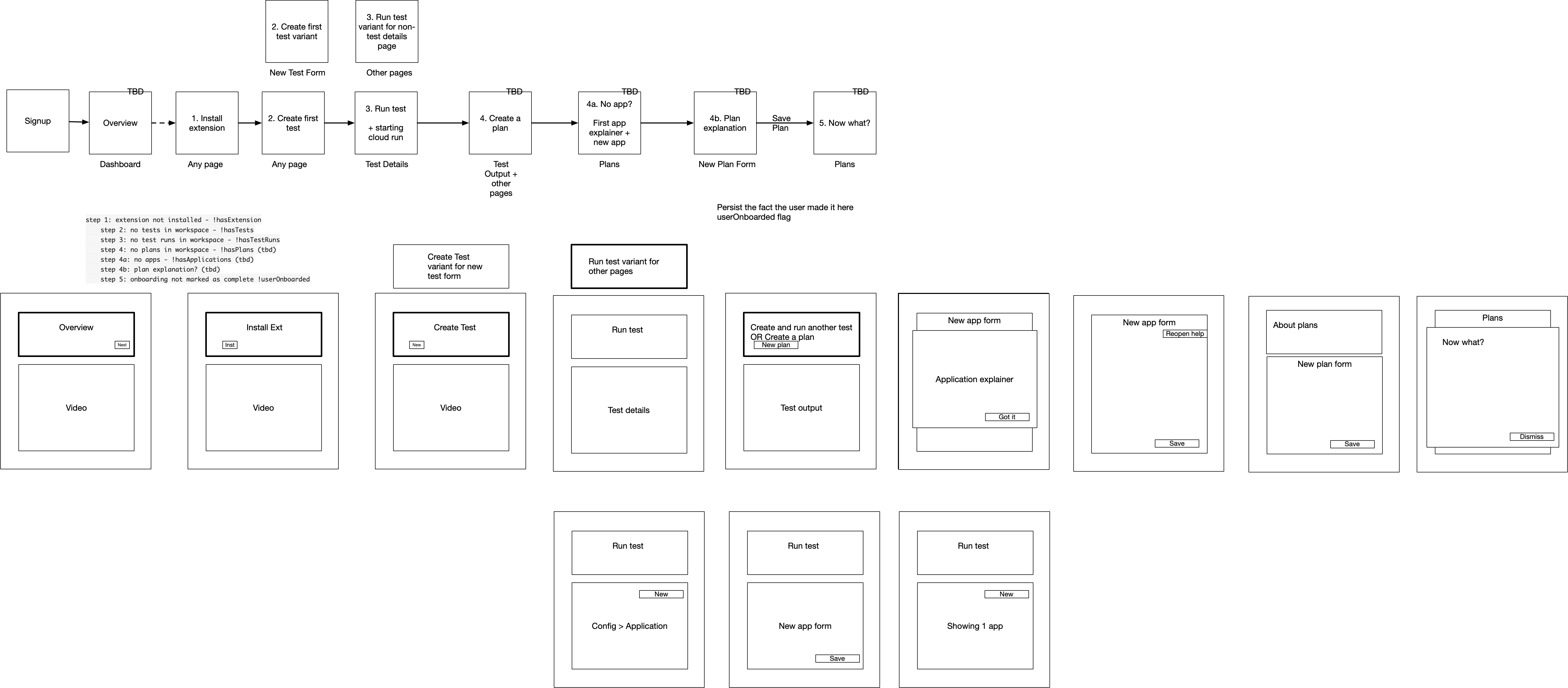
I worked out the desired workflow showing mandatory steps new users must take and where they could branch to explore from there.
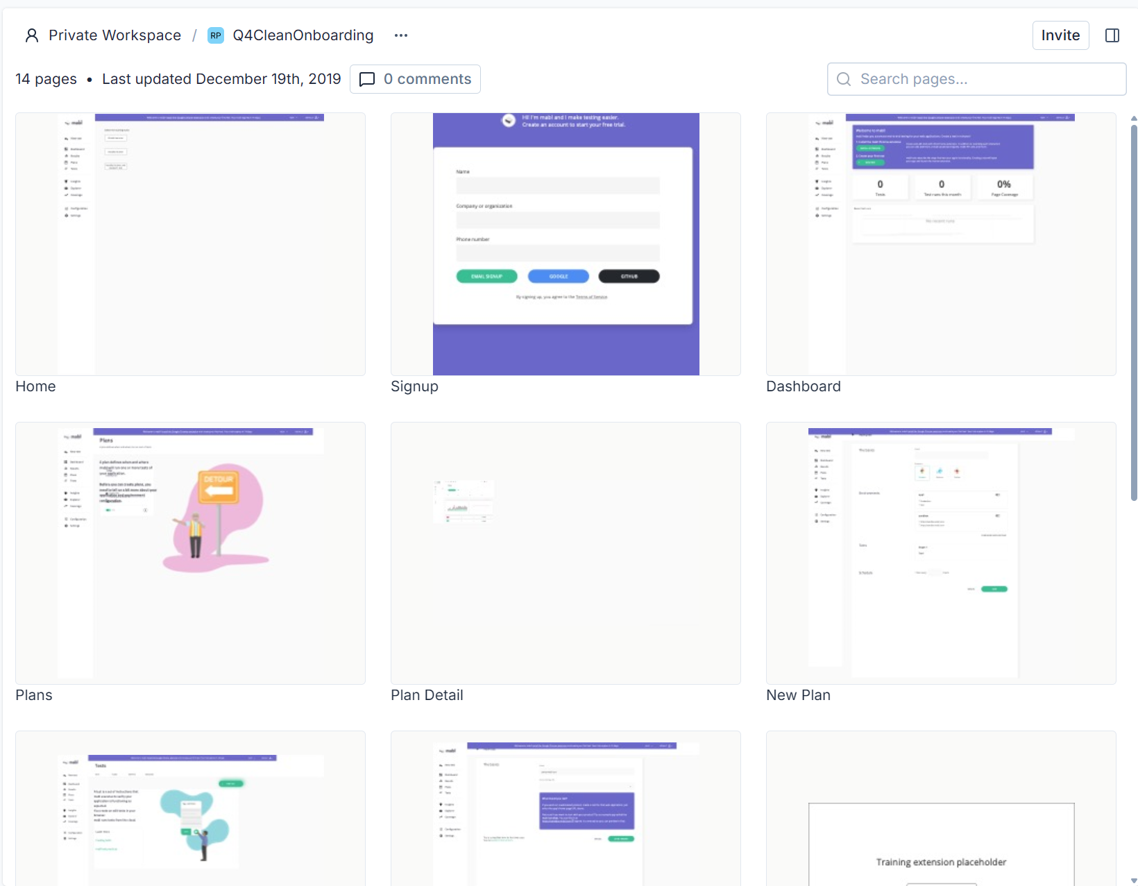
Wireframes
These wireframes outlined where on-screen guidance appears for each on-boarding state.
Interactive Prototype
In conjunction with my design team who refined visual design concepts, I built an interactive prototype in Axure to test onboarding flows. Participants could navigate freely and create virtual tests using the prototype. It allowed us to test in-app guidance and users’ conceptual understanding as they learned the product.
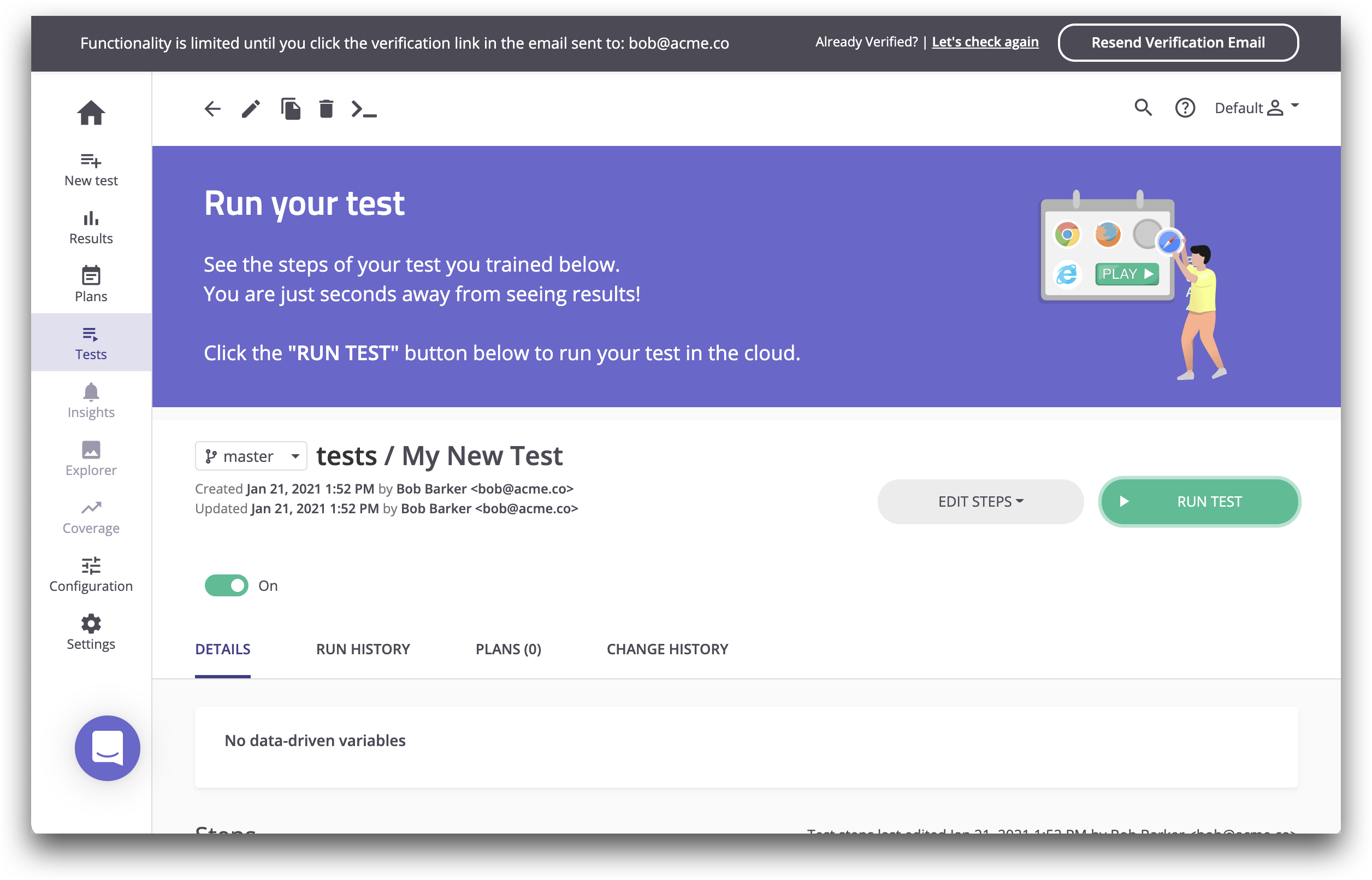
Final Design
Finally, we refined copy and visual design and worked closely with engineering to deliver the improved experience.

Results

The first phase of the update, enabling independent test execution, was praised by existing customers. It eliminated one of their main frustrations and made it more efficient to create and maintain tests.
The second phase has immediate positive impacts on the trial experience. A product manager had been sampling FullStory sessions before and after the change and reported huge subjective improvements:
…overall the friction that users encountered has been significantly reduced…
The first full quarter following release saw the trial conversion rate jump to 15%, a factor of 3 improvement. Not only that, but trial users hit our “qualified lead” criteria within days instead of weeks, many on their first day.
